Bronze Sculpture for Sale

Upload an image to find similar artworks
Artsper now offers more than 200,000 works of art and design objects from the best galleries around the world. Every day, new contemporary artists and galleries join our catalog, as Europe's leading online art dealer. Meet the most important names in the history of modern and contemporary art, young stars of today's market, and emerging talents who are already shaping the future. Painters, photographers, draughstmen, sculptors or designers… Find them all on Artsper!
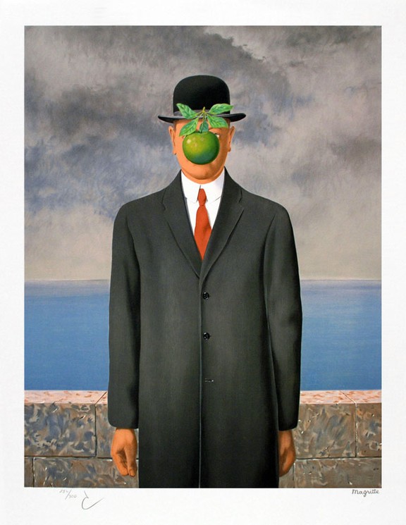
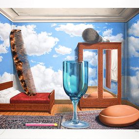
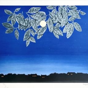
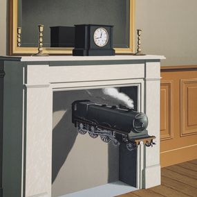
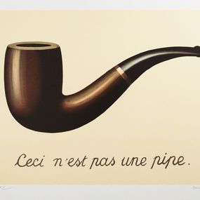
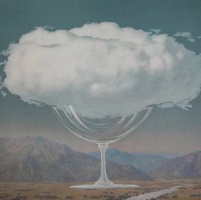
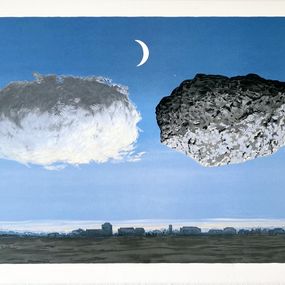
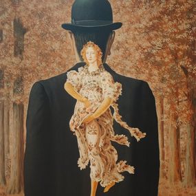
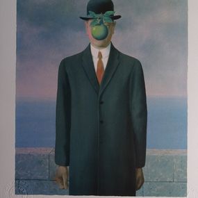
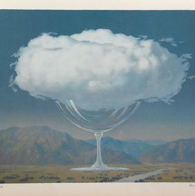
If one is to understand today's art market, one needs to understand modern art and the advent of contemporary art as we know it. Let's start in 1907, when Cubism became the first movement to radically emancipate itself from the realistic representation of subjects. The leaders of this movement? Pablo Picasso and Fernand Léger. In 1924, Surrealism continued on this quest, aiming to remove all boundaries between the real and the unreal. Artists such as Salvador Dalí, René Magritte, or Max Ernst propose their own conception of the world, distorted according to the perceptions of each. Their unique approaches and artistic practices continue to inspire young artists even today.
From 1945 onwards, experts generally consider that we are moving from modern art to contemporary art, with the major difference that artists give less importance to the medium used than to the creative idea.
Inspired by the revolutionary reflections of the great masters of Surrealism, Cubism but also Dadaism (think of Marcel Duchamp) from the 1950s and 1960s, artists push the reflection on abstraction much further. Minimalistic art then appeared, as well as conceptual art. In contrast to the abstract expressionists (such as Joan Mitchell, Mark Rothko or Jackson Pollock), the great names of these movements include, for example, Frank Stella or Sol Lewitt.
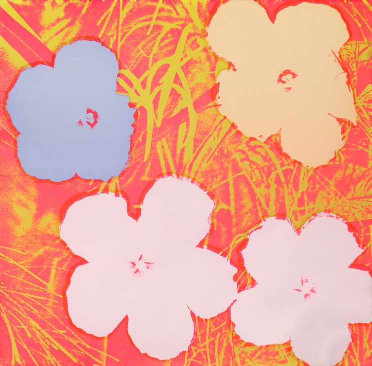
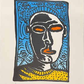
Pop art opens a new pictorial trend in the visual arts. This artistic movement was inspired by the consumer society in which it evolved. It uses the latest technologies to create colorful works, in the image of pop culture personalities for example. The two great undisputed masters of Pop art are Andy Warhol and Roy Lichtenstein.
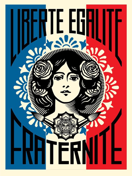
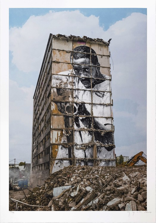
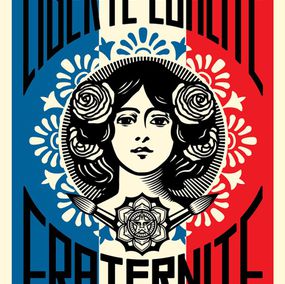
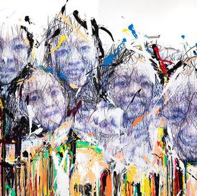
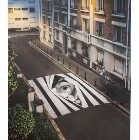
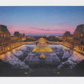
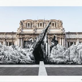
From the 1980s onwards, it was the street artists who gained importance on the art market. For a long time considered as a vandal art, Street art now enjoys a much important status, as it is shown in galleries and international museums. You can also find works of famous street artists in prestigious private collections around the world. Among these artists, let's mention Keith Haring, Shepard Fairey (Obey), JR, Aiko, JonOne, Miss.Tic...
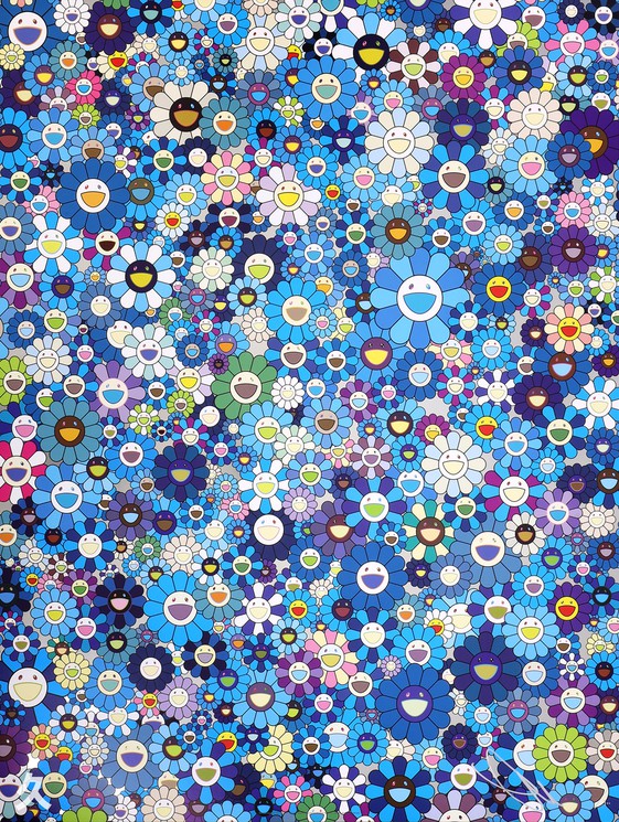
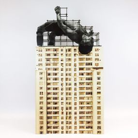
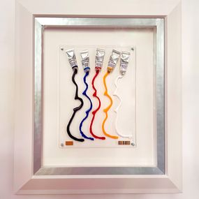
In the Artsper catalog, sculptors have an important seat at the table. In small or large format, they work with all materials (wood, steel, bronze, ceramics or resin) and exploit all color palettes. Some are world-renowned and others are stars on the rise: You can acquire original work by Niki de Saint Phalle, Takashi Murakami or even Jeff Koons as well as emerging talents such as Daniel Arsham and Richard Orlinski.
Finally, Artsper also offers contemporary artists who are masters in digital art. This genre, which is also a medium, has exploded in the last decade thanks to new technologies and a strong interest in innovative and disruptive art. They operate outside the ultra-virtual sphere of NFTs and AI (artificial intelligence)-generated works, but these contemporary digital artists produce in a 100% digital way. They explore abstract as well as figurative art, and are inspired by hyperrealism as well as futurism. They form the pioneer generation of 21st century art. Among them, you can discover for example the work of Valentin Pavageau, La Robotte and Edwin Wide Donnart.
The diversity of styles and mediums is one of Artsper's core values, allowing everyone to find exactly what they need. Let yourself be carried away by the multitude of talents in Artsper’s catalog and go with your heart... Now it’s up to you to pick your perfect piece!
The artists you should be keeping an eye on


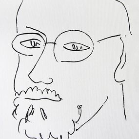
Fine Art Drawings . 29.5 x 18 x 0.5 cm Fine Art Drawings . 11.6 x 7.1 x 0.2 inch
€2,950


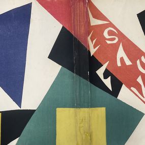
Painting . 22 x 14 x 2 cm Painting . 8.7 x 5.5 x 0.8 inch
€38,000


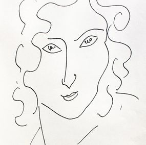
Fine Art Drawings . 100 x 100 x 1 cm Fine Art Drawings . 39.4 x 39.4 x 0.4 inch
€11,900


Sculpture . 66.5 x 56.5 x 4 cm Sculpture . 26.2 x 22.2 x 1.6 inch
€5,500


Sculpture . 61.5 x 27.5 x 12 cm Sculpture . 24.2 x 10.8 x 4.7 inch
€28,000

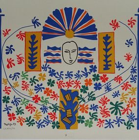
Print . 38.8 x 25.7 x 0.1 cm Print . 15.3 x 10.1 x 0 inch
€20,500


Choose your preferences
The best
of art, online
SIGN IN - REGISTER
Forgot your password?
No worries, enter you email address and we'll send you a link to reset your password.
ReturnUpload an image and discover similar artworks available on Artsper