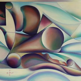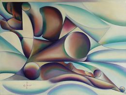
This graphite pencil drawing beautifully arranged "Nina – 23-08-23" is already the third I have made of this magnificent lady. What next, I asked myself? While the last drawing showed her in her metallic beauty, I was not sure I wanted to make a similar one. I have a pile of reference photos, including one where she is lying on a bed. This one caught my attention even though it showed many soft tones. However, the composition was beautifully arranged and her body contours seem to support that. I found soft and fluid curves but I also detected hard, linear, sharp structures when studying them more closely. Enough to stimulate my artistic fantasy. Minimalistly I quickly arrived at the correct proportions, so I had extra time to think about the cubist style. The application of solarization also came to mind. You see, because of the backlighting, her body seemed to flow into the negative space. This made the photographic setting simply too bright. The solarization helped me and I didn't even need to apply a significant tonal range. I didn't want to lose the stylized legs and abdomen too much. Minimalistly, I already liked them and I made sure to leave some areas open. This way, they would communicate with the surrounding space. Dots Points There were two pillows near her feet on the left and also a floor lamp near her shoulder. I ignored the second one. The folds of the lampshade would have competed too much with the luxuriant and voluminous hair. The lower pillow was dotted. On a whim, I decided to slightly indicate these dots. Through this, I obtained a contrast with the opaque planes that cross the representation. Balancing contrasts The overall objective is often revealed at the end. This is what I always tell students. There is no real intention to play and have fun. See what you can achieve. Perhaps I have learned to be patient and listen to my inner voice. It is not a rational way of listening but a subconscious process, while playing, that is it. Overall, the work makes perfect sense to me now. There are detailed structures in the middle, on the left and right. There are contrasts between light and dark, different levels of abstraction. I am even surprised that the limbs seem very abstract but credible and convincing. I realize that this partially caused the more realistic features of her face. Do you agree? graphite pencil drawing (matte graphite pencil Faber Castell Pitt 14B) on Fabriano Ingres paper (21 x 29.7 x 0.1 cm) Artist: Cornè Akkers :: Drawing :: Cubism :: This work is accompanied by an official certificate of authenticity signed by the artist :: To hang: No :: Signed: Yes :: Signature location: bottom left corner :: Paper: Landscape :: Original: Yes :: Framed: No